Thales & the First Options Trade
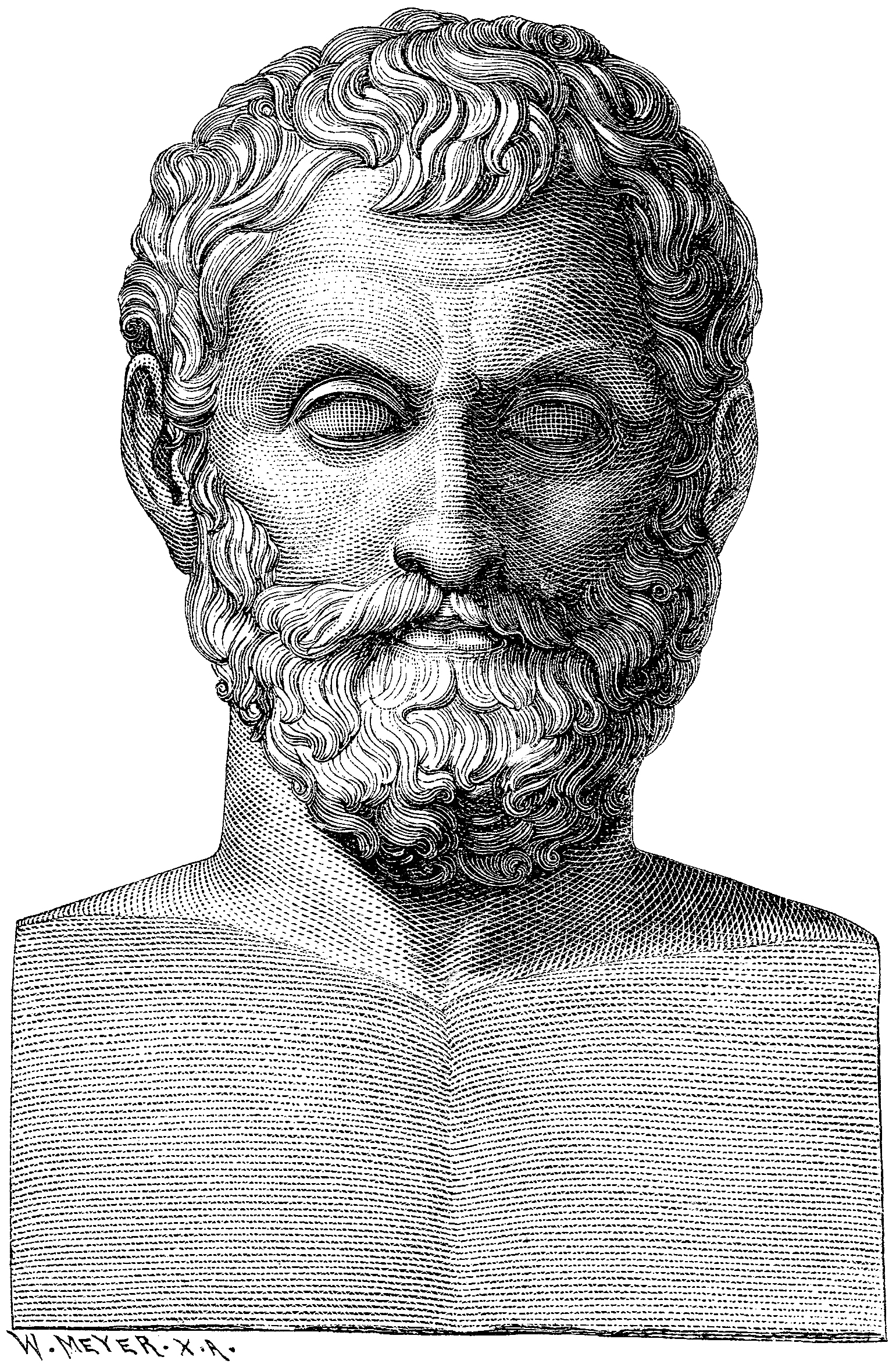
Twenty-five centuries before anyone uttered the phrase "call option," a Greek philosopher in a shabby cloak was being mocked for having no money. Thales of Miletus — one of the Seven Sages of antiquity, the man who first proposed that the world could be explained without gods — was, by all accounts, financially unremarkable. His neighbours thought this proved philosophy was useless.
Thales disagreed. According to Aristotle, he studied the stars one winter, concluded the olive harvest would be enormous, and quietly bought options on every olive press in Miletus and Chios. When the bumper crop arrived and every farmer in Ionia needed a press, Thales controlled the supply. He rented them out at whatever price he liked and made a fortune.
He didn't keep the money. The point, Aristotle tells us, was to prove that philosophers could get rich — they simply chose not to. The first recorded derivatives trade in human history was, essentially, a philosopher winning an argument.
What makes this exhibit remarkable isn't just its age. It's that Thales' trade has every element of a modern options play: an asymmetric bet, limited downside (he only risked the deposit), enormous upside, and an informational edge. The structure hasn't changed in 2,500 years. Only the olive presses have.
Tulip Mania & the Bubbler's Medley
In the winter of 1637, a single tulip bulb — variety: Semper Augustus, white petals streaked with crimson — sold for 10,000 guilders. A skilled craftsman earned 150 guilders a year. You could buy a grand canal house in Amsterdam for the price of that flower.
Then, on the third of February, a routine auction in Haarlem produced no bids. The market didn't correct. It evaporated. Within weeks, bulbs that had commanded small fortunes were worth less than onions. The Dutch Republic had just lived through the first recorded speculative bubble, and the cultural aftermath was savage.
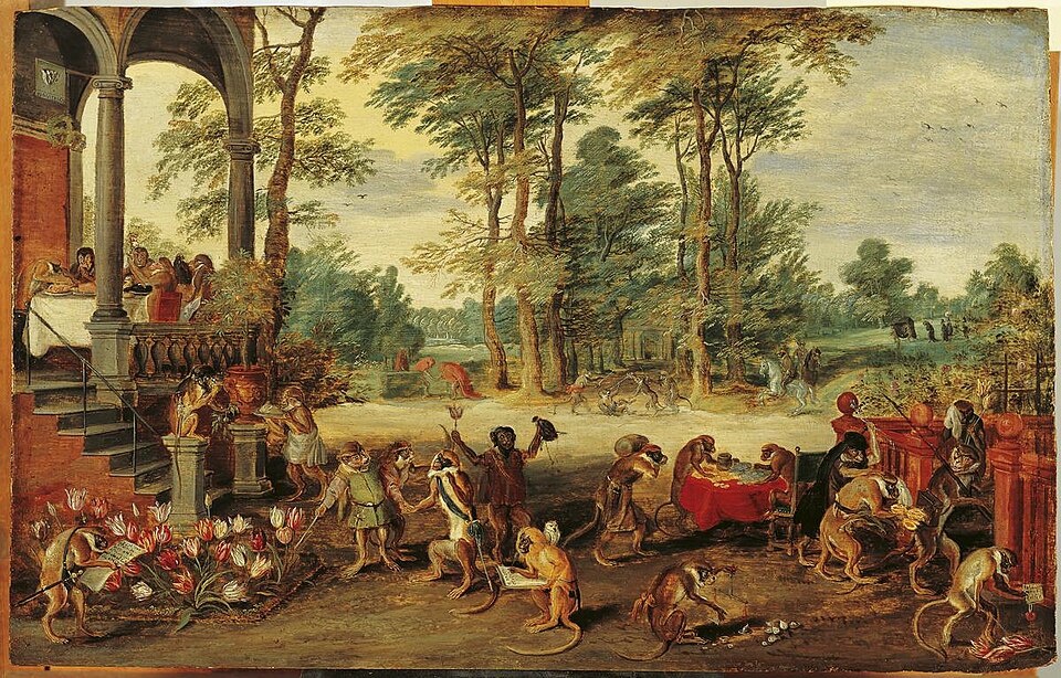
Pamphleteers produced satirical prints showing monkeys in finery trading flowers. Morality plays toured the provinces. And most remarkably, Dutch writers mapped the psychology of the crash into a sequence that would look instantly familiar to anyone who lived through crypto in 2022: curiosity, greed, mania, denial, crash, blame. They called the satirical charts the "Bubbler's Medley" — and they claimed these cycles were predictable.
They were half right. Hyman Minsky would formalise the same sequence 340 years later, and economists would name a crisis after him. The Dutch pamphleteers of 1637 didn't have the math. But they had the psychology exactly right.
Isaac Newton & the South Sea Bubble

In the spring of 1720, Sir Isaac Newton — Lucasian Professor of Mathematics, inventor of calculus, the man who literally explained gravity — invested in the South Sea Company. He bought early, watched the stock soar, and sold for a profit of roughly £7,000. A clean 100% return. Disciplined. Rational.
Then he watched the stock keep climbing. His friends were getting rich. The coffeehouses were buzzing. And Isaac Newton, the most formidable intellect the world had yet produced, bought back in near the top.
When the bubble burst in September, Newton lost £20,000 — roughly $4 million in today's money. He banned all mention of the South Sea Company in his presence for the rest of his life. And he supposedly said: "I can calculate the motions of heavenly bodies, but not the madness of people."
The quote may be apocryphal. The lesson isn't. Intellect is no defence against FOMO. Even the man who invented physics couldn't resist buying the top.
Nathan Rothschild & Carrier Pigeons

The legend: On June 18, 1815, Nathan Rothschild's private courier network — including carrier pigeons — brought him news of Wellington's victory at Waterloo a full day before the official dispatch reached London. Rothschild, the story goes, stood on the floor of the London Stock Exchange and sold British bonds. Other traders, seeing the great Rothschild sell, assumed Napoleon had won. Panic selling ensued. Then, at the bottom, Rothschild reversed course and bought everything back at a fraction of the price. Overnight, he became the richest man in Europe.
The reality: Almost certainly false. Modern historians have found no contemporary evidence that Rothschild engaged in any such trade. The story appears to have been invented decades later by anti-Semitic pamphleteers looking for a villain. What is true is that the Rothschilds did maintain one of Europe's fastest private communication networks — and they absolutely used it to trade on information before their competitors. But the dramatic "Waterloo coup" is likely myth.
What makes this exhibit fascinating isn't whether it happened. It's that the structure of the trade — informational edge, misdirection, liquidity provision at distressed prices — is plausible enough that people believed it for 150 years. And every HFT firm today is running a version of the same play, just with fibre-optic cables instead of pigeons.
W.D. Gann & the Master Charts

William Delbert Gann claimed to have made over $50 million trading commodities and stocks in the early 20th century using a system based on geometry, astrology, and Biblical numerology. His "Square of Nine," "Gann Angles," and "Master Charts" supposedly unlocked the mathematical structure of time and price. He gave seminars. He published books. He attracted a cult following that persists to this day.
The problem: when Gann died in 1955, his estate was worth $100,000. Not $50 million. Not even $1 million. One hundred thousand dollars. For context, that's less than most successful accountants of his era retired with.
Gann made his fortune selling courses on how to get rich trading. His actual trading results were mediocre at best. But his charts were so beautiful — and his mysticism so compelling — that traders wanted to believe. And many still do. You can buy Gann software today.
Roger Babson & Gravity Theory

Roger Babson, a devoutly religious statistician and entrepreneur, founded the Gravity Research Foundation in 1948 with a singular mission: defeat gravity. He believed that just as apples fall from trees, stock prices must obey Newton's Third Law — "for every action, there is an equal and opposite reaction." When markets rise too far, they must fall.
On September 5, 1929, Babson gave a speech predicting: "Sooner or later a crash is coming, and it may be terrific." Eight weeks later, the market collapsed. Babson became famous overnight. They called it the "Babson Break."
What nobody remembers: Babson had been predicting a crash every year since 1926. He was wrong three years in a row. When he finally got it right, everyone forgot the misses and remembered only the hit. He spent the rest of his life applying Newtonian physics to economics — and being wrong most of the time.
Benner's Prophecies

In 1875, Samuel Benner — an Ohio farmer and iron foundry owner who'd lost everything in the Panic of 1873 — sat down and mapped out a theory of economic cycles. He published a single pamphlet: Benner's Prophecies of Future Ups and Downs in Prices. It contained a hand-drawn chart claiming to predict market peaks and troughs for the next century based on recurring 8-year, 9-year, and 10-year patterns.
Astonishingly, several of Benner's predictions came true. He called the 1891 panic, the 1907 crash, and (depending on how generously you read the chart) even gestured in the direction of 1929. Traders in the 1920s and '30s treated the chart like gospel. It was reprinted, analyzed, and revered.
Then it stopped working. By the 1950s, Benner's cycles had drifted so far out of alignment with reality that nobody could reconcile them. The chart is now a curiosity — a beautiful example of pattern-matching that worked just long enough to be dangerous.
Hemline Index

In 1926, economist George Taylor proposed the "Hemline Index": women's skirt lengths correlate with stock market performance. In bull markets, hemlines rise (flappers in the Roaring '20s). In bear markets, hemlines fall (ankle-length dresses in the Depression). The theory was half joke, half serious — and it got reprinted in financial journals for decades.
The logic, such as it was: consumer confidence drives both fashion risk-taking and stock-buying. When people feel wealthy, they show more skin. When they're scared, they cover up. Ridiculous, yes. But also… kind of elegant?
The problem: the correlation broke down completely by the 1970s (miniskirts and stagflation?) and has been useless ever since. But it persists as a meme. Bloomberg still writes about it. Because it's memorable. And in markets, memorable beats rigorous every time.
Super Bowl Indicator

Leonard Koppett, a sportswriter, noticed in 1978 that the stock market's annual performance correlated perfectly with which conference won the Super Bowl. NFC victory? Bull market. AFC victory? Bear market. From 1967 to 1978, the indicator had a 100% success rate.
For the next decade, it worked. Financial journalists wrote about it. Portfolio managers joked about using it. Some may have actually traded on it. The correlation held through the 1980s and into the '90s. Astonishing.
Then it collapsed. By the 2000s, the Super Bowl Indicator's accuracy had regressed to coin-flip territory (~50%). But like all good market superstitions, it refuses to die. ESPN still mentions it every February. Because it's funny. And because humans will pattern-match anything if you give them enough time.
Dogs of the Dow

The "Dogs of the Dow" strategy is elegantly simple: at the start of each year, buy the ten highest dividend-yielding stocks in the Dow Jones Industrial Average. Hold for a year. Repeat. The theory: high yields mean the stocks are beaten down and undervalued. Mean reversion will carry you to outperformance.
From 1973 to 1996, it worked. The Dogs outperformed the Dow by an average of 3% per year. Money Magazine wrote about it. Mutual funds launched around it. Retail investors piled in.
Then, predictably, it stopped working. From 2000 to 2010, the Dogs underperformed the Dow. The strategy had become too popular. Everyone was front-running it. The edge evaporated.
Lesson: simple, rules-based strategies work beautifully — until they don't. And they stop working precisely when everyone believes they will work forever.
Lipstick Indicator

Leonard Lauder, chairman of Estée Lauder, proposed the "Lipstick Indicator" in 2001: lipstick sales increase during recessions. The logic: when people can't afford big-ticket luxuries (vacations, cars, handbags), they trade down to small indulgences — lipstick, nail polish, cheap thrills. Estée Lauder's sales spiked after 9/11. Lauder called it a leading indicator of economic distress.
For a while, it tracked. Lipstick sales surged in 2001, 2008, and 2020. Analysts wrote earnest reports. But the correlation is weak at best. Sometimes lipstick sales rise because of new product launches. Sometimes they fall during recessions because people just stop spending entirely.
The Lipstick Indicator is less a forecasting tool and more a narrative device. It feels true. But feeling true and being true are very different things.
Hindenburg Omen
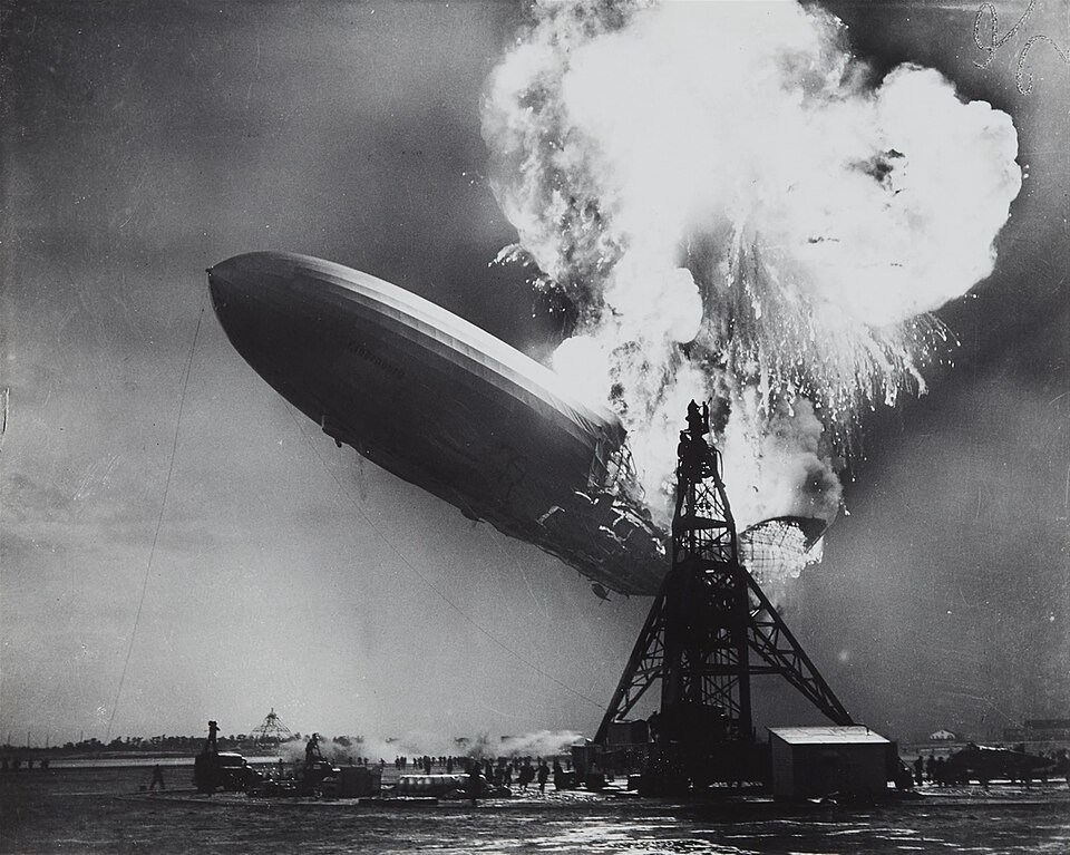
The Hindenburg Omen, named after the 1937 airship disaster, is a technical indicator designed to predict stock market crashes. It triggers when the number of NYSE stocks hitting 52-week highs and 52-week lows both exceed 2.8% of total issues on the same day, among other conditions. The theory: extreme divergence signals internal market chaos and impending collapse.
Jim Miekka created it in the 1990s. It "predicted" several crashes — 2000, 2007, 2008. Bloomberg wrote about it. Traders watched for it. The name alone made it famous.
But it's triggered dozens of times without crashes following. The false-positive rate is high. And when it does "work," it's often weeks or months before the actual crash, making it nearly useless for timing.
The Hindenburg Omen is exhibit A in scary-sounding indicators that feel predictive but mostly just generate headlines.
January Effect

The January Effect is one of the most studied anomalies in finance. The claim: small-cap stocks systematically outperform large-caps in January due to year-end tax-loss selling and portfolio rebalancing. Investors dump losing positions in December for tax purposes, then buy back in January, driving small-cap prices up.
From the 1920s through the 1980s, the January Effect was robust. Academic papers documented it. Fund managers positioned for it. It was real.
Then it vanished. By the 2000s, the January Effect had largely disappeared. Why? Arbitrageurs. Once everyone knew about it, traders front-ran the effect in December, flattening it out. The anomaly got arbitraged away.
The January Effect is now a historical curiosity — proof that market inefficiencies can be real, measurable, and profitable right up until the moment everyone knows about them.
The Skyscraper Indicator

In 1999, Andrew Lawrence — a property analyst at Dresdner Kleinwort — noticed something odd. Every time a city built the world's tallest building, an economic crisis followed. The Panic of 1907 came right after the Singer Building. The Great Depression arrived with the Empire State Building (1931). The 1997 Asian Financial Crisis coincided with the Petronas Towers. The 2008 crash? Burj Khalifa started construction in 2004, topped out in 2009.
Lawrence called it the "Skyscraper Index." The logic: record-breaking construction projects require massive capital, which only flows freely at the peak of credit booms. By the time the ribbon is cut, the boom has turned to bust. The skyscraper is a monument to hubris — and a tombstone for the cycle that built it.
Critics point out that the correlation is cherry-picked. Plenty of tall buildings went up without crashes. Plenty of crashes happened without skyscrapers. But the hits are so dramatic — and the metaphor so perfect — that the Skyscraper Indicator refuses to die.
The current worry? Jeddah Tower in Saudi Arabia, planned to be over 1,000 meters tall. Construction stalled in 2018. Maybe someone read Lawrence's paper.
The Magazine Cover Indicator

The Magazine Cover Indicator is simple: major business publications are lagging indicators. By the time a company, executive, or trend makes the cover of TIME, Forbes, or The Economist, it's already over. The peak has passed. The smart money has moved on. What remains is hype, distribution to retail, and the inevitable unwind.
The evidence is anecdotal but damning. BusinessWeek declared "The Death of Equities" in August 1979 — right at the start of an 18-year bull market. TIME featured Bitcoin on its cover in January 2018 at $17,000 — it crashed to $3,000 within a year. The Economist ran "Drowning in Oil" in March 1999 when oil hit $10/barrel — it went to $147 within a decade.
But the most brutal examples involve people. Forbes and Fortune have a near-perfect track record of putting executives on covers right before their empires collapse. Kenneth Lay (Enron), Bernie Ebbers (WorldCom), Elizabeth Holmes (Theranos) — all graced magazine covers shortly before fraud revelations or bankruptcy. The magazine cover isn't just a lagging indicator. It's a curse.
Why does it work? Because journalists chase narratives that are already widely believed. By the time the story is compelling enough for a cover, the trade is crowded, the valuation is stretched, and the only direction left is down. The cover is the top.
Sell in May and Go Away

The full rhyme goes: "Sell in May and go away, come back on St. Leger's Day." St. Leger's Day is a horse race in September. The idea: the UK stock market underperforms from May to October (summer doldrums, holiday trading, low volume), and outperforms from November to April. So sell in May, take the summer off, buy back in autumn.
For over a century, it worked. Academic studies confirmed it. The "Halloween Effect" (a variant: buy on Halloween, sell on May Day) showed statistically significant outperformance in the US, UK, and European markets from the 1950s through the 1990s. The effect was real, measurable, and exploitable.
Then it became famous. Mutual funds started positioning for it. Retail investors read about it in Money magazine. By the 2000s, the edge had flattened. Some years it still works. Some years it doesn't. The anomaly didn't disappear — it just got arbitraged down to noise.
What's left is a meme. Financial Twitter still jokes about "Sell in May" every spring. But if you actually traded it? You'd underperform a simple buy-and-hold. The market doesn't tolerate free lunches forever.
The Presidential Cycle

The Presidential Election Cycle Theory claims US stock market returns follow a predictable 4-year pattern tied to presidential terms. Year 1 (post-election): weak, as new policies shake out. Year 2 (midterms): worst, as unpopular decisions are made early. Year 3 (pre-election): best, as the president pumps the economy to win re-election. Year 4 (election year): strong but volatile, as markets price in the next administration.
Yale Hirsch popularized the theory in the 1960s using data going back to 1833. The pattern held remarkably well through the 20th century. Year 3 of presidential terms averaged 16% returns. Year 2 averaged under 5%. The logic made sense: politicians manipulate fiscal and monetary policy to goose growth before elections. Markets respond.
Then the 2000s happened. The pattern broke. Year 2 of Bush's second term (2006) was strong. Year 3 of Obama's first term (2011) was flat. Year 2 of Trump's term (2018) crashed in December. The correlation weakened as central banks took over from presidents, globalization diluted US-centric effects, and markets became forward-looking enough to price in election outcomes years in advance.
The Presidential Cycle still gets cited every four years. And sometimes it still works. But it's no longer the reliable trading signal it was in the 1970s. The market evolved faster than the theory.
Fibonacci Retracements

Leonardo Fibonacci was a 13th-century Italian mathematician who studied how fast rabbits breed. His sequence (1, 1, 2, 3, 5, 8, 13, 21...) shows up in nature: sunflower spirals, nautilus shells, galaxy arms. The ratio between consecutive numbers converges to 1.618 — the "Golden Ratio" — which artists and architects have used for centuries.
In the 1970s, technical analysts decided this also applied to stock prices. When a stock rallies, it "should" retrace to Fibonacci levels before continuing: 23.6%, 38.2%, 50%, 61.8%. These aren't arbitrary — they're derived from the Fibonacci sequence. And traders swear they work. Draw the lines on a chart, wait for price to bounce off 61.8%, buy the dip. It's beautiful. It's mystical. It's everywhere in trading software.
The problem: there's zero causal mechanism. Why would stock prices, driven by earnings, interest rates, and human psychology, obey the same ratio as rabbit reproduction? They don't. Fibonacci retracements "work" because millions of traders believe they work, creating self-fulfilling support/resistance. And even then, they fail constantly. But when they hit, it feels like magic.
Fibonacci retracements are the astrology of technical analysis. Elegant, ancient, mathematically sophisticated — and completely untethered from reality. But try telling that to someone whose 61.8% retracement trade just worked. They'll show you the chart. They always show you the chart.
Elliott Wave Theory
Ralph Nelson Elliott was a railroad accountant who got sick, retired to California in the 1930s, and spent his recovery studying stock charts. He emerged with a grand unified theory: markets move in predictable wave patterns driven by mass psychology. Five waves up (impulse), three waves down (correction), nested infinitely across timeframes. The structure repeats fractally from minutes to decades. He published The Wave Principle in 1938 and claimed he'd discovered the fundamental rhythm of human behavior.
Elliott Wave Theory is seductive. The patterns do show up on charts — sometimes. And the framework is so flexible that it can explain anything. If the market doesn't follow the expected pattern, you just relabel the waves. Wave 2 becomes wave 4. Wave 5 becomes an extension. The beauty of Elliott Wave is that it's unfalsifiable. You can never be wrong — you just miscounted.
Robert Prechter revived the theory in the 1980s and built a multi-million-dollar newsletter empire around it. He correctly predicted the 1987 crash (sort of — he'd been predicting crashes for years). But his major calls since then have been disasters. He predicted Dow 400 in 2002 (it went to 14,000). He called for a deflationary collapse in 2010 (we got a bull market). Elliott Wave analysts still issue confident forecasts. They're just never accountable when the waves don't wave.
The community is vast, passionate, and utterly convinced. Online forums debate wave counts like Talmudic scholars. Is this wave 3 of 5, or wave 1 of an extended 5? The arguments never end. Because the theory is structured so that the arguments can't end. That's not a bug. It's the entire design.
Astro-Economics & Arch Crawford
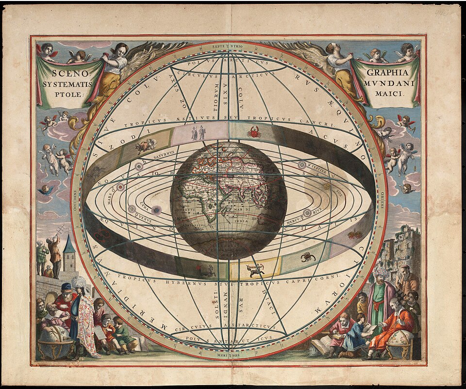
Arch Crawford was a Merrill Lynch technical analyst in the 1970s when he had an epiphany: the planets control the stock market. He quit Wall Street, started a newsletter called the Crawford Perspectives, and began tracking lunar cycles, solar eclipses, planetary conjunctions, and Mercury retrograde alongside price charts. His thesis: human psychology (and therefore markets) is influenced by gravitational forces, electromagnetic fields, and celestial alignments. Astrology isn't mysticism — it's physics we don't yet understand.
In October 1987, Crawford issued a rare "crash warning" based on a rare planetary alignment: a Uranus-Saturn conjunction. The market crashed two weeks later. Suddenly, financial astrology had credibility. He appeared on Wall Street Week. Institutional clients quietly subscribed to his newsletter. If it sounds insane — well, he called the crash, didn't he?
Then came the misses. Crawford predicted crashes in 1996, 1999, 2003, 2005, and 2011 that didn't happen. He missed the 2000 and 2008 crashes entirely. His track record regressed to noise. But he never wavered. The stars don't lie — the timing just shifted. Or the alignment was misread. Or Saturn was in retrograde.
Crawford passed away in 2021, but financial astrology lives on. There are still newsletters tracking the "Bradley Model" (a siderograph predicting market turns based on planetary geometry). Traders still blame Mercury retrograde for weird price action. It's W.D. Gann's mysticism updated for the Space Age — and just as untestable.
The Odd Lot Theory
In the pre-digital era, stocks were traded in "round lots" of 100 shares. Anything less — 1 share, 10 shares, 50 shares — was an "odd lot," the domain of small retail investors who couldn't afford full positions. The Odd Lot Theory, popularized in the 1950s and '60s, claimed these small investors were reliably wrong. When odd-lot buying surged, it signaled a market top (dumb money chasing). When odd-lot selling spiked, it signaled a bottom (dumb money capitulating). The strategy: fade the odd lots. Trade against retail. It worked.
The logic was simple: small investors have no edge. They buy high (after a rally), sell low (after a crash), and time their trades based on emotion rather than analysis. Institutional investors — the "smart money" — could use odd-lot data as a contrarian indicator. And for decades, it was profitable.
Then the world changed. Fractional shares arrived. Online brokers democratized trading. Retail investors got smarter (or at least faster). By the 1990s, odd-lot data became unreliable. By the 2000s, it was meaningless. The meme-stock era of 2021 flipped the script entirely: retail traders on Reddit drove GameStop and AMC to the moon while hedge funds blew up. Suddenly, fading retail was a death sentence.
The Odd Lot Theory is now a relic. The assumption that retail is always wrong died with commission-free trading and social coordination. The peasants have smartphones now. And sometimes, they win.